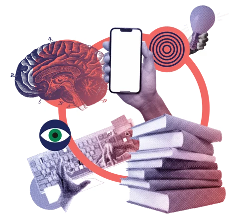
It’s second nature to scroll. Whether we’re browsing social or skim-reading news articles, scrolling is a standard navigation pattern.
Scrolling has become the default navigation for learning too. In the early days of e-learning, when authoring tools could quickly convert PowerPoint materials into online courses, ‘click next’ was our default.
Fast forward 20 years, and learning design software like Articulate Rise and Evolve has a new standard navigation – the scroll. Emerging touch-screen technology gave it a whole new mobile lease of life in the mid ‘00s, so how’s it holding up?
Today, around half of users will start scrolling within 10 seconds of landing on a page – within 14 seconds, 90% scroll. It’s our instinct to scroll, it makes navigating long pieces of content workable, and it’s faster to move through linear content than clicking and loading new pages.
But there are downsides…from the tl:dr or ‘rage-quitting’ trap, when users abandon long-form content, to ‘zombie-scrolling’ – which involves scrolling but not engaging or absorbing content – this ‘second nature’ navigation can be dangerous.
So how do we avoid ‘death by scrolling’ becoming the new ‘death by PowerPoint’ learning experience? Desq’s Head of Learning shares her insights...
Use scrolling where it lends itself to function - like with visual storytelling. Clever interactions, like animations and use of sound, can bring the scrolling experience to life. Storytelling is a great resource – we can borrow from it to make engaging learning.

The Boat is a great example of how design, clever animation and sound can bring pace and drama to long-form single-page content.
Design it to be digestible - design plays a vital part in punctuating scrolling content – magazine style layouts make content digestible, setting a ‘little and often’ rhythm and chunking content accordingly. And we know that users attribute more value to content near the top of a page, so we can help reset the brain by using headers in text to create a new sense of what’s ‘top’.
Show clear orientation – just by making clear where people are on the page can subtly reassure them, giving them a sense of progress. A sticky navigation menu helps too, so users don’t need to scroll back to the top to find out where they are or navigate elsewhere; ‘jump-to’ cues guide people around longer scrolling content, like tutorials and bookmarks mean users can learn at their pace.
Deliver the occasional surprise - because if a learning experience is going to connect, it needs to deliver the odd surprise. Nothing too exciting – just a little ‘jolt’ to scrolling – like clicking to a new section, or changing to a parallax scroll.
Make hard-working, quality content – create direct, clear, engaging writing, a balance of visual and written content, at-a-glance stats and always introduce your content well – tell users what they will get and punctuate for a sense of beginning, middle and end.

Design can bring pace and variety to scrolling navigation with graphic or illustrative breaks, videos or interactive elements that need a click, and digestible chunks of content, like our recent work with Fujitsu.
“There’s a lot to play with, and done intelligently the ‘scrolling’ aspect of the experience isn’t noticeable – it’s just a means to an end.
Use design, animation, layout, good content and interactions with real purpose, to deliver learning that engages and connects, even if we move through it by scrolling. The scroll function will only be the death of your online learning if you let it.”
Laura Giles, Head of Learning at Desq
How will you bring scrolling to life in your next digital learning project?